technology pitted against the environment

Related image
@studio.ghibli

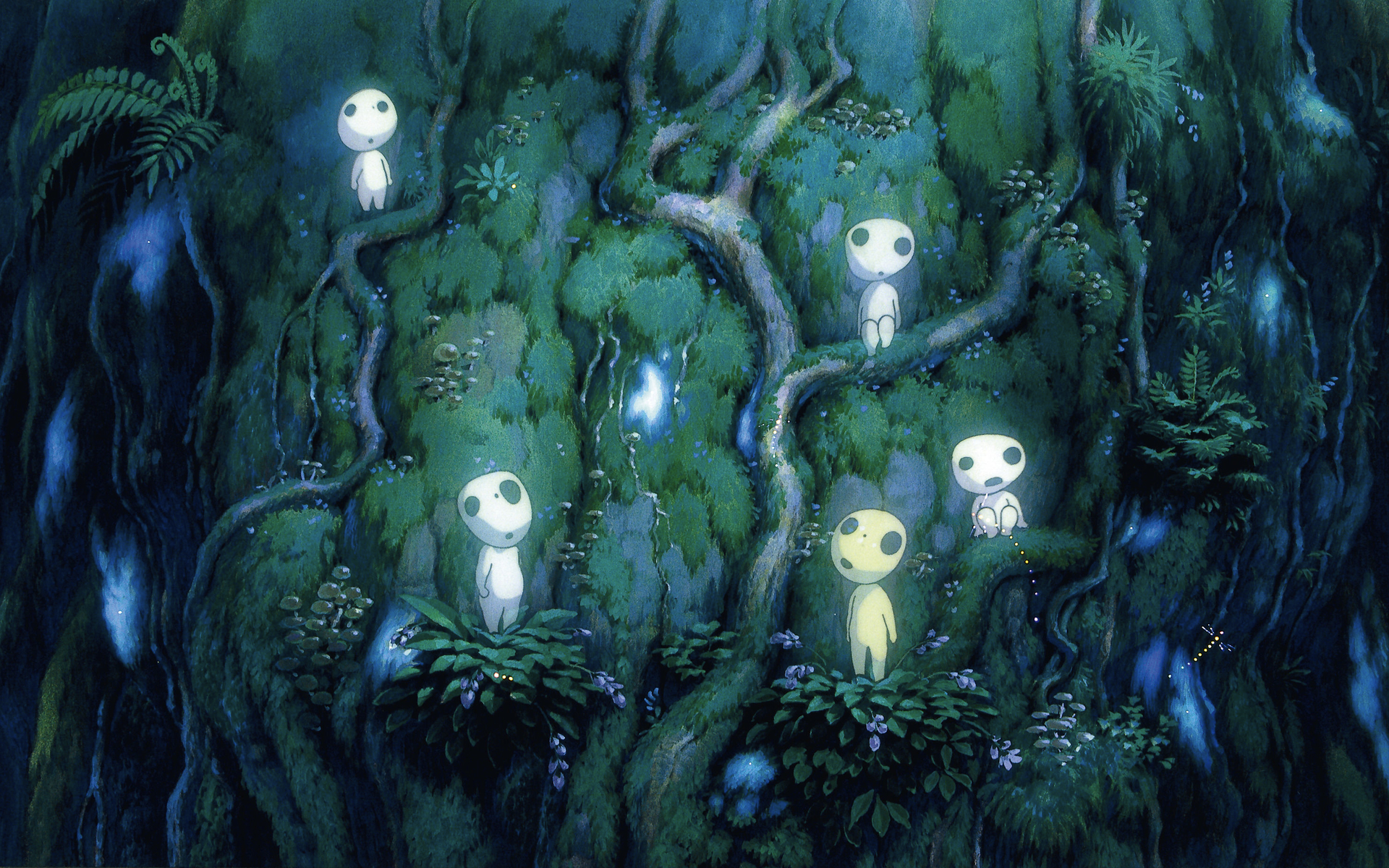
Years ago, I was completely fascinated with the anime film, Spirited Away. If you’ve never heard of Studio Ghibli, I highly recommend you check out their work. I was encouraged to watch Princess Mononoke by a friend the other day (after divulging my love for the more famous sibling), and having 2 and a half hours of free time this weekend, I decided to take the plunge.

Spirited Away was a visual masterpiece. So I had extremely high hopes for this film. And honestly, Princess Mononoke was even better for me. I’ve mentioned before how I’m not a huge environmentalist. But, as a somewhat self-aware human being, I tend to fall into a category of worldly conscientiousness.

The film surrounds a protagonist that falls upon a world in which the industrious Iron Town is furiously pitted against the gods of the Forest. The heads of both sectors have their own thoughts in mind, almost completely unaware of the others peril, let alone well being (or intentions).

Iron Town represents human expansion, technology, and self-proclaimed dominance. The Forest represents land, nature, and the purist idea that humans are only there to destroy.

Image result for princess mononoke iron town

Without getting too political, it seems in the current age of power-hungry individuals/organizations who only seek their own agendas, this movie is still a perfect illustration (no pun intended) of the world some 20 years later. The protagonist is seen fluctuating between the sides: he is completely neutral, and can see the negatives and positives of both industry and nature. He urges each side to truly see the other – encouraging conversation, peace, and coexistence. Each side is stubborn, as you can imagine.

And as a consumer, I often forget about the world, and my (inevitably negative) effects on it. When in nature, I tend to feel I’d be perfectly (naively) content living off the grid, away from humanity. The two are inherently poised against each other. And yet, the movie shows that, in the perfect system, we could be closer to a world in which, awareness and symbiosis could be achieved. Amazing how art can cut so deep, in the most beautiful way possible.

Image result for princess mononoke nature

Meta-Blog:

@domoa

A blog referencing another blog.

If you had told me a few years ago – months even – that I would have a blog in the future, I would’ve laughed hysterically. Not at you. Believe me, that humor would’ve been pointed directly back to me. I don’t find myself, let alone what I say, interesting enough to Blog about. If it hadn’t been for this assignment, I don’t think I would ever pick up something like this. And I haven’t hated it. Honest.

It’s funny too, because blogs have been something I’ve avidly followed for years. They transcend genres, people, cultures, languages, etc. And the few I do follow now, are purely visual; the ability to do that with just pictures, is crazy.

I’m featuring one today. Domo-A. It bugged me when I first saw the title. It reads: Domo-A Inspiration Blog. The grammar nerd inside me was like, “Sydney, you can’t follow a person who doesn’t even know how to use ‘a’ and ‘an’ properly.” Turns out, the handle is just Domo-A. And turns out, I’m the daft one.

I digress. This blog features a seemingly endless stream of print and web graphic design. And graphics being the first thing I studied at art college, it holds a special place in my heart. I only studied in the program for a year before I switched majors into industrial design. But, it’s one of those areas of focus in the art and design world that still captivates me.

Almost everyone (I say everyone, because my college is my own little microcosm) tends to say graphic design is the easy form of design. But when non-graphic designers have to do graphics…Lord give me strength.

I find myself judging? (I can’t find the right word here) other artists, thinking I can do the same or even better. So it’d be hypocritical of me to say I’m different. But, graphic design is one of those mediums that can’t be duplicated easily. And I wish people could realize that.

Even if it’s minimalistic, the ability to see form, negative space, typography, etc. is a talent. Each artist and designer should be given credit for their studies and work. It’s something I’m going to have to work on. I would’ve lost the bet that wagered on me having a blog. And look where I am now – typing away.

If you don’t have any blogs on your heavy rotation, I highly recommend finding a few. If they’re all extremely different, even better. I’m not putting my blog into the category of successful ones by any means. Now I know how difficult and mentally challenging it is. Check out a few of my favorites:

Lemanoosh. PassanaPassa. Windows of New York. Plenty of Colour. Made by Folk. Abduzeedo. Identity Designed. Beatrice Cerocchi.

A Mile higher

@layer.design

Flying is such an immersive experience. If you’re a frequent flyer, you oftentimes aren’t aware of the whole process when you’re in the middle of it all. I find myself caught up in the anxiety of long lines, the stupid people arguing with flight attendants, and hurrying up just to wait some more.

But, if time isn’t necessarily a big concern for you during travels, let your mind wander to all of the cool things you come in contact with. The engineering of flight alone, is fascinating. You’re up in the air, miles above ground, eating your crappy complimentary pretzel snacks, completely aware of the fact that the tin tube you’re rocketing in, could fall out of the sky at any moment. And yet, we all willingly do it. Because it’s awesome.

I’ve been in every thing from propellor planes (completely terrifying might I add) to the new-ish luxury 737 from Boeing. And if you’re in one the newer planes, it’s much easier to think about the details we often overlook. Insert the seats.

Seating is extremely important to flying; you’re sitting down 99.9% of the time (unless your bladder is the size of a walnut). And yet, seats haven’t been upgraded all that much within the past few years. The silhouettes, materials, headrest and tray table positions, are just a few things that fliers can expect to be very constant. I came across a design firm called Layer the other day. They do some pretty cool stuff (and all very different too). But the one thing that really stood out to me, was their re-envisioned airplane seating.

I highly recommend checking out their project page here for all of the glorious details. This is one of the coolest re-designs I’ve seen in a while. If I was able to fly in something like this, I’d start taking trips just so I could experience it regularly. Talk about elevated (wow so punny). If design makes you excited about doing something more, that’s a success in my eyes.

@layer.design

One man’s trash is another man’s treasure

I strolled through the Detroit Institute of Arts (DIA) museum this morning and came across a larger-than-life piece by El Anatsui in the Great Hall (photos above). From afar, it seems average. But when viewed up close, you can see the individual pieces, and it takes on a whole new form.

The description states that each molecule of the art was made from reclaimed aluminum liquor bottle caps. It reminded me of an artist from a film I watched a few years ago. His name is Vik Muniz, and he uses garbage collected from the infamous Jardim Gramacho dump site in Brazil to create unbelievably life-like and beautiful portraits:

Image result for vik muniz wasteland
@vik.muniz

I find large installation pieces fascinating to begin with – the majority of my work tends to be confined to smaller sketch pages – so the overwhelming stature of a work like this is particularly captivating. The attention to detail is fantastic, but it also speaks to a lot of comprehensive movement and fluidity.

As I was standing there (moving to and fro, close and far from the art) every single person who walked by was pulled in. The gravitational force of a piece like this is monumental. Even if someone wasn’t initially interested by the form, the description of the work (or physical closer inspection by that individual) tends to fully grasp them. Thinking of the shear volume of bottle caps someone would have to collect to even begin to create a work, is in itself, a feat. Not to mention the commentary it transcribes.

I would love to go into a deep dive on sustainable art in the near future. However, seeing something like this in person really does make a huge difference. After today, I’ll have to make a point of viewing (especially composed and intricate pieces like this) in person.

Community-based apps on the rise

@spot.angels

I’m assuming most – if not all people – have heard of the traffic/direction app called Waze. When it came out a few years ago, it took a long time for people to understand the premise, and for it to gain enough customers for the community-based platform to actually work. The goal was to have users report accidents, heavy traffic, and even cops on the road for others to see (and hopefully avoid). My dad was a very early user, and swore by it. Now, years later, it’s one of the biggest community-based apps on the market.

Insert another one I found the other day: Spot Angels. They only have a few locations – mostly high density urban areas – where parking can be an absolute nightmare. The app let’s users report empty parking spaces (and rates for each). Their website also claims to warn their users of street cleaning warnings, snow plowing, etc.

I lived in Portland, and not having a designated parking space within my apartment building – and that city being majority biking and walking (aka not a lot of available spots) – I found parking to be horrendous, especially on weekends where there were big events going on downtown.

I find community-based apps to be really interesting. In the age of Amazon and Google, many people find people-oriented tech to be more reliable and connected. Although it rides on the average person being trustworthy and dependable (and people inevitably doubt the good-nature of those on the platform) I’ve found they’re usually pretty flawless. I’m interested to see what other community apps people come out with in the future.

A teacher’s experiment with cellphones

I am reposting something interesting I found on Facebook. A teacher by the name of Chris Rousey (I won’t link anything for the sake of privacy) conducted a technology experiment in his classroom. I’m attaching his words below. I think this is simple and brilliant. Enough said. Enjoy.

If you don’t think cell phones are a distraction in school, please check out the experiment that I conducted with my classes. Please note that I do not allow students to use their phone in my class. They are not allowed to have them out at all. For one day only, I had my students turn the sound on for their notifications. Every time they got a notification, they had to walk to the board and put a mark on the board under the appropriate category. The pictures are the results of my 3 regular math 8 students. Each class has between 25 and 28 students. After the first class, I had to color code the chart. Black was friends in this school, orange was family, and blue was other. (Ignore Lindsey’s data, she told her dad to send her messages all thru class. She was being funny.) Overall, it was a huge eye opener for my students, staff, and parents.

Chris Rousey

creating clean drinking water out of thin air

Clean drinking water is a commodity. According to the Thirst Project, over 663 million people in the world do not have clean drinking water. I’ve traveled to several places where the public water system is either unsuitable for digestion, or completely nonexistent. In Haiti especially, I had to drink water out of small bags like these:

Image result for water bags haiti
@alandeherrera

The plastic waste from these bags is out of control however, and honestly might add to the problem more than it helps. So it really intrigues me when I see a project surrounding harvesting water, like the Creating Water Foundation‘s “fogfarming,” where they quite literally pull clean drinking water from thin air.

Here is what happens. They set up a net system in the outskirts of Lima, Peru. This area is notorious for fog, so, their system capitalizes on the unused condensation in the atmosphere. The condensation gathers when the wind from the coast pushes fog through the nets. These droplets then fall down into a gutter-like system that then pours the water into large containers for storage. Those containers can then be accessed by organizations for distribution, or by individuals in surrounding communities for personal consumption.

The nets are installed by locals, creating jobs within the process of long-term solutions as well. The installation is fairly inexpensive, especially in relation to water purification systems that require a lot of man power and electricity to operate.

What is even more incredible to me, it that they have a complete guide/manual outlining how to install your own net system on their website. For free. How amazing is that?? A company with a beautifully intelligent design, gives away assets like this just to help people. That to me, is truly something.

infographics are cool

I’m a big sucker for graphs. I become absolutely fascinated with the physical representation of data, and yes, you can call me a nerd for that. Completely understandable. But, if you aren’t a graph person, I implore you…why not??

Fun fact, the infographic was created by Florence Nightingale. I recently found that out from a random podcast I was listening to the other day. The infographic is meant to distill dense – and oftentimes industry specific jargon – and display it for the average person to comprehend. She created these visuals (graphs and infographics especially) to show her theories on medicine and combat mortality rates. Here’s a preview of one of her masterpieces:

Image result for florence nightingale infographic
@economist

Now, I digress slightly. Bringing you back to present day, BASF – the leading enterprise for OEM color coatings in North America – released their Color Report for 2018 in mid-January. I hadn’t looked at it since there doesn’t seem to be very interesting diversions as of late from the norm; but, they broke down vehicles by segment – subcompact, compact/midsize, and onward – and the infographics sucked me in:

Doesn’t seem very interesting until you go segment by segment. The majority of vehicles in the States are currently achromatic (white, gray, and black). That’s not hard to comprehend. But then you go by subcategories (largest graph shown above) and you see that sports cars have a rising section of yellow paint in their totals. All of these categories show different results, each just as interesting as the last.

Trend forecasters, I’m sure, are all over the potentials for expansion in these specific categories. I’m not completely sure how these data points relate to last years results, but nevertheless, it’s fascinating. If you want to check out the full report I highly recommend looking up the pdf they supply (I can’t seem to embed a pdf file to this website, so Google BASF Color Report 2018 and you’ll find it).

There’s a new way to damage control

Image result for trov insurance

I’m a fairly responsible person. And yet, my phone has been accidentally left in many bathroom stalls and one time, an Uber. Now, I’ve remembered to go back for it (and in the case of the Uber, I tracked it down just fine thanks to my more than attentive driver) and I found it in every occasion. Quite honestly, I’m not super attached to the information on my phone. So despite the hard hit of buying a new one, everything gets uploaded to the cloud and I can always log into accounts on a new device. But, if I lost my computer somehow, that would probably be devastating. I just finished a hard-drive backup earlier today, but when all of your student and freelance work is on one device, it becomes extremely valuable.

I’ve had to do short-term insurance before (renter’s, travel, etc.) and it was a pain in the butt trying to get the right company, coverage, and time period for my needs. During a research assignment this weekend, I came across a company called Trov that sells single-item insurance, with the fluidity of on-demand protection. A lot of their glowing customer reviews were from photographers who covered expensive cameras and gear. They advertise bikes, guitars, antiques, tech gadgets, and more on their website.

Scrolling through their several categories, I was really intrigued with their platform. Going overseas for a study abroad trip? Select the specific amount of time you’ll be out of the country, and boom, totally covered. Accidental damage, loss, theft, mechanical failure, etc. is all taken care of. I don’t know their rates because I couldn’t be bothered with plugging all my information in to get bombarded with promotional emails, but I highly recommend checking out their site. Or watch the video below.

The New “living shoe”

PUMA MIT Design Lab Biodesign Project breathing sneakers bacteria carbon insoles t-shirt sportswear biology
@biorealize

These shoes have bacteria in them. On purpose. Is your mind blown yet? Here’s a video to explain the different layers of the new shoe Puma has released in conjunction with MIT design.

Now, I’m a little creeped out by the fact that there are product-eating microorganisms in the sole of something I put on my foot. The idea alone though, makes me want to try it out.

What I want to know is, how did someone think of this?? Puma: let’s put bacteria in the soles of our shoes. MIT: we can do that.

I mean, c’mon that’s some space age stuff right there. I don’t really know what else to say, except I definitely want to see these in person one day!